Weekly Photo Challenge: Home afloat

Whenever you go somewhere that speaks to your soul, you are going home to yourself.

Martha Beck

home-afloat

Windsong II, our sailboat, is my home afloat right now. It rocks us to sleep at night and cocoons us when the weather is wild. It takes us to see new places and allows us to meet new people who also love the boating life.

I love the light that streams through the companionway in the morning as we drink our steaming coffee and munch on our toasted English muffins and jelly. (In this case, it’s ginger jelly. Ginger is known to prevent seasickness, but that’s not why we eat it. It just tastes amazing.)

Practical note: The Tervis tumblers you see pictured here are double-walled so they keep liquids hot or cold much longer than other cups.

Softly, softly…

This triptych is for Week Three in Beyond Beyond with Kim Klassen. The challenge was to experiment with focusing on different areas of the same shot to see what kind of effects could be created. I used my nifty fifty F.1.4 extremely wide open to get the blurred backgrounds. I added a few layers of Kim’s “softly” texture to, well, yes, soften the images further.

finaldof

Mystery by the sea…

Every month Kat Sloma of Kat Eye Studio asks us to pick an image from the month that we are most drawn to…one that calls to us and captivates us.

Here is my January image for her Photo Heart Connection. I love it because it tells a story — but what story?  It suggests bigger themes, but the meaning is left to the viewer to discern.

The young woman is all alone on the craggy coral overlooking a wild and windy ocean and she is looking at her cell phone. Is she checking her messages? Is she thinking about calling someone? Is she trying to capture the beauty in front of her?

stage2

I was standing quite far away from her and shooting images in the opposite direction. I remembered my father’s photographic advice (he was a pretty good amateur photographer so I grew up going on photo shoots with him and whatever little camera I was using at the time). He used to say: “Don’t forget to turn around and look behind you;  sometimes there’s something more interesting there…” So I did.

I immediately noticed her standing there on the cliffs. And I liked her solitary stance overlooking the ocean. I could see she had something in her hand, but I couldn’t see what. I clicked a few images. I was using my long lens (70 to 200 mm) so it was only later when I downloaded the images I could see she was holding a cell phone.

But that should not come as any surprise.

These days we mediate so much of our direct experience through communications technology. We document so much of our lives and then share it in a multitude of ways. I’m no exception, obviously.

A bigger philosophical question is why… I think that it has something to do with a yearning for connection. We are social beings and we want to make meaning of our experiences and share them with others. We want to feel that we are not totally alone in this huge, sometimes scary, world of ours.

We seek communion in a sharing of the mysteries of living — the awe-inspiring mysteries of the wild places that turn our thoughts heavenward, and the not-so-awe-inspiring mysteries of the earthly life we all live every day.

I will never know what this young woman was doing, but she wasn’t alone.

Texture Tuesday: Colour pop

This week, I’m sharing my “pop of pink” with Kim Klassen’s Texture Tuesdays. (If you’re yearning for a bouquet of mood-boosting colourful images, you’ll want to hop on over there right now.)

Processed with Kim Klassen’s “musiclight” texture. Font is 1942 report.

I have to admit that I am easily pleased. And one of the things that always pleases me is beautiful colour, whether in the natural world or the human-made one . But it was in Kat Sloma’s Find Your Eye course that I first understood my own preferences and relationship to colour in my images.

From the beginning I have been attracted to and repelled by certain uses of colour, but it was all unconscious until I spent some time reflecting on it in Kat’s excellent courses.

If you’re looking to refine your unique photographic style, I would highly recommend her online courses. They help you to “dive deeper into experiencing the environment around you and learn to understand what calls to you.”

I have come to realize that I am not generally one for riotous mixtures of disorganized colour in my images. I realize I am very affected by colour and too much can be jarring and over stimulating to look at.

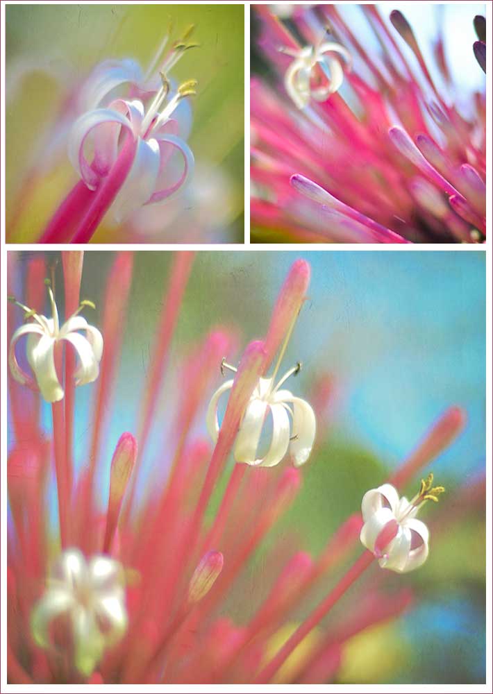
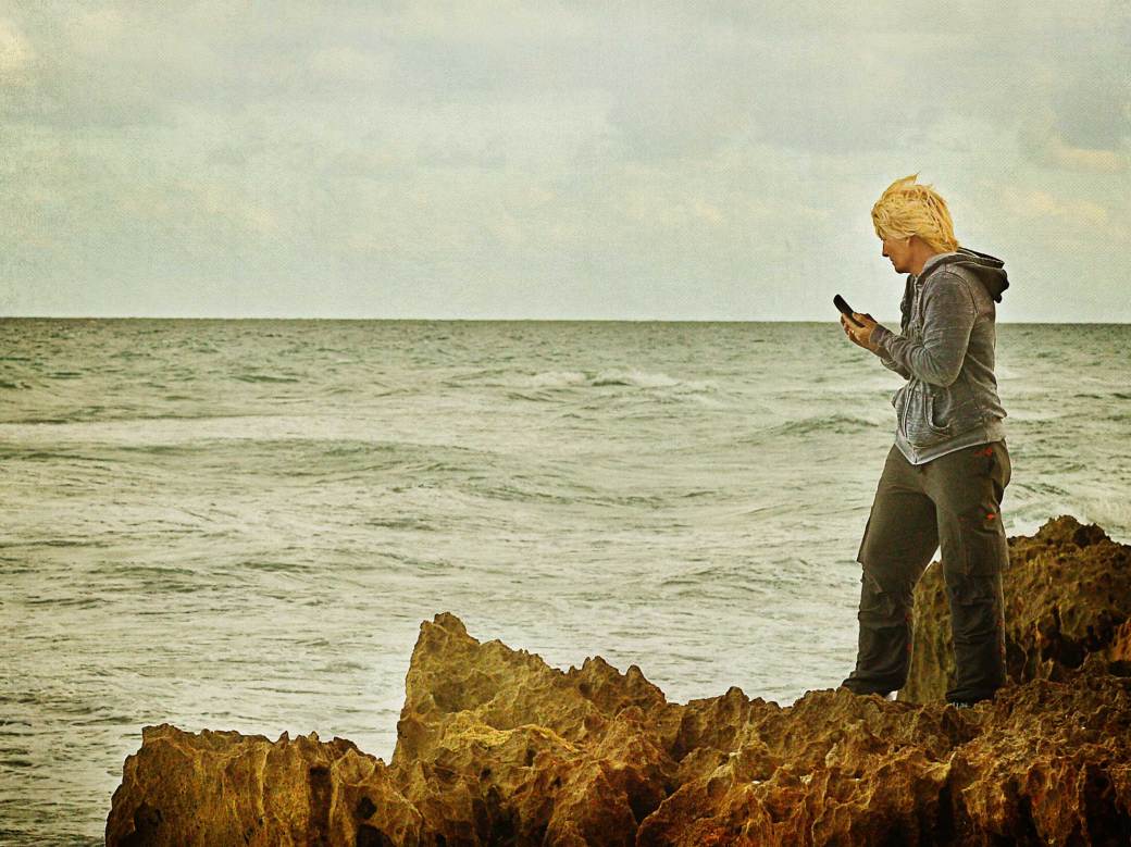
I am most often drawn to very subtle, soft and restrained colour palettes rather than primary hues. I love monochrome or almost-monochrome images.  When using more colour, I prefer analogous schemes — colours that nestle next to each other on the colour wheel (like blues and turquoises and greens) — which are often found in nature. The shifting colours of the ocean never cease to pull my camera in their direction.

The other way colour shows up in my images is as soft complementary colours — opposite colours on the wheel — like blue and orange or pink and light green. Most of the time I shoot these pairings quite unconsciously…and when I come home and look at my images in Bridge, I’ll shake my head to realize I’ve done it again!

Mark Nepo, the author of the quote above, has many wonderful books out — one of his most well known is the Book of Awakening.

If you’re a fan — or curious to know more about him — you might enjoy a wonderful interview with Mark Nepo by Jennifer Louden.

Weekly photo challenge: Unique

I don’t know why…I just thought a photo of a manatee lying on its back drinking water might be considered unique…but I guess it all depends on what your normal is, right?

manatee

Visit my blog Two Salty Dogs for more on life on a sailboat in Florida. (Just click the pic.)

I normally live in Canada so I don’t see a lot of manatees. But when I’m living on a sailboat in Florida (like now) I tend to see them every once and a while.

Manatees take up residence primarily in Florida’s coastal waters during winter. They can also be found in the warm waters of shallow rivers, bays, and estuaries. Rarely do individuals venture into waters that are below 68 degrees Fahrenheit.

I love gentle creatures like elephants. Manatees are a large aquatic relative of the elephant and are very gentle too. They are slow moving and playful and have been known to body surf and barrel roll when playing.

Manatees are grayish brown in color and have thick, wrinkled skin on which there is often a growth of algae. Their front flippers help them steer or sometimes crawl through shallow water. They also have powerful flat tails that help propel them through the water. They are herbivores and they eat marine and freshwater plants.

Manatees only breathe through their nostrils, since while they are underwater their mouths are occupied with eating! A manatee’s lungs are 2/3 the length of its body.

The leading human-caused threat to Florida manatees is collisions with watercraft, mostly powerboats. Propellers and boat hulls inflict serious or mortal wounds, and you often see manatees with a pattern of scars on their backs or tails after surviving collisions with boats. Scientists believe that unless this cause of death is curtailed, the manatee population will not recover.

There is a great effort to educate boaters about the dangers they present to manatees and I can only hope the message is getting through…These gentle giants were here first and we must learn to share the water with them.

Spend the afternoon…

kk_bbday1challenge_sample

I’m taking this wonderful online class with Kim Klassen, called Beyond Beyond. Well, it isn’t so much a class as a creativity kickstarter. She mixes instruction and tips in Lightroom and Photoshop with huge dollops of inspiration, ideas and encouragement.

It has been so heartening to meet throngs of people (mainly but not exclusively women) across Canada and the United States (and even further afield) who share my passionate interest in image-making. We have formed a lovely supportive online community and share our work freely on Facebook and Flickr and other social media sites. Daily, I am amazed at their artistry and creations.

Today, our challenge is to take one of Kim’s images and make it our own with the addition of her textures and other Lightroom and Photoshop techniques.

In my version, I cropped the image square because I love curvy lines within squares. I used a layer of Kim’s “zuzu” texture and a desaturated layer of “-43”. Then I added some lighting and blur effects and masked them off the bowl and pine cones.

I added the Annie Dillard quote (Jenna Sue font) and curved it to suggest a smile. The quote reminds me to spend our days mindfully. Time is as much of a treasure as money. And neither will be there forever. It is up to each of us to figure out how best to spend them.

spend-the