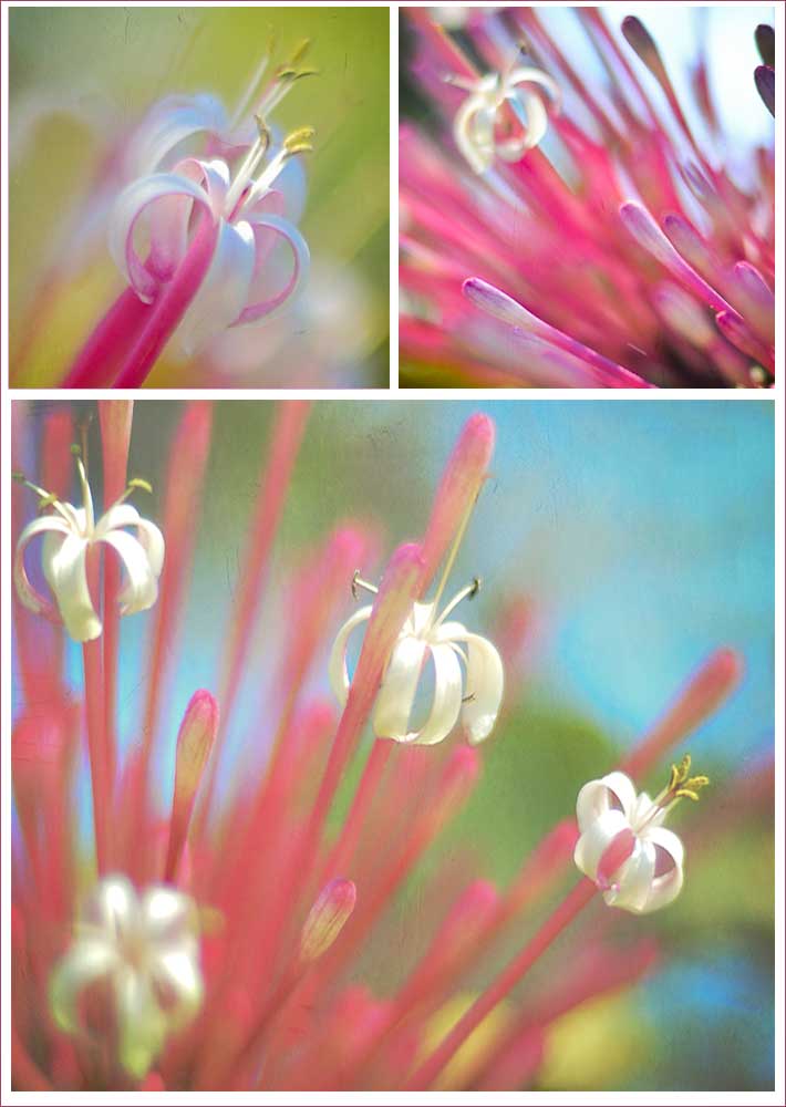
This triptych is for Week Three in Beyond Beyond with Kim Klassen. The challenge was to experiment with focusing on different areas of the same shot to see what kind of effects could be created. I used my nifty fifty F.1.4 extremely wide open to get the blurred backgrounds. I added a few layers of Kim’s “softly” texture to, well, yes, soften the images further.


Beautiful! Happy Valentine’s Day!
Sherry, Love the soft pastels and composition. Beautiful!
Beautiful color and love the whole feel of this.
These are amazing, Sherry! I love the colors and the softness of each image.
Wow! This is amazingly beautiful and the way you have used color is breathtaking!
Yes! The entire reason I decided to take B2 was to stretch myself. The style is completely different than what I usually do, so difinitely outside my comfort zone. I’ll do one — but no guarantees that I’ll like it! 🙂
Appreciate the kind thought, Janel.
What lovely, soft, wonderful colors. Just beautiful.
So nice of you to say!
Thanks, Kim!
There is something very alluring about pastel-like softness, isn’t there?
Thanks, Candace!
I didn’t realize it, actually. Thanks for the comment!
Thanks, Sheryl-Elaine!
You have a good one, too, Laurie! I think I like the same one best…
I’m not actually sure. There are so many flowering trees here in Florida that I’m not familiar with being from up north 😉 I am not a collage person either — I prefer my images to stand alone, but it’s good to try things from time to time. Sometimes they work out better than you think. That said, if you get an image you like and don’t make a collage, that’s great too!
beautiful!!!!
I normally favor the very close ups but in this setting the farther away one is catching my eye. Have a great weekend.
It sure does!
How lovely! I love the repetition.
They’re all so pretty, I’m especially drawn to the upper right one.
Very nice. What kind of flowers are these? I’ve taken lots of shots for this assignment but haven’t figured out what to do for the collage part. I don’t do collages often — just not my thing (I think) — so I’m dragging my feet a bit. Still, I took one photo that was just so yummy that I’m going to use it somewhere, even if it doesn’t make it into a collage. It just seemed perfect for Valentine’s Day, as well as a soft pink spot of color perfect for gloomy Winter.
So Beautiful. I just love the softness of these photos.
So lovely! Beautiful coloring and processing – great job on the challenge 🙂
Very nice! Not sure which one I like the best, they’re all lovely in their own way. Looks like you and I are both on a “pink” theme this week. 🙂
I am always thrilled when a photo captures my heart and I love how you’ve taken just a simple flowers and made it powdery soft looking and the colors are lovely.. awesome job..
Hugs