The colours of Valencia…

yellow flowers

Valencia! Or Valenthia, as it is pronounced here…What a lovely place to spend some time in the spring. Oranges, paella, tapas, Agua de Valencia (a local cocktail), horchata (a milky drink made of tiger nuts), Las Fallas (an annual cultural celebration in March) and warm climate are all immensely appealing to me, as is the history, culture, architecture and Mediterranean coastline. And that’s just for starters.

I’ll be doing a series of posts on Valencia as I explore the area with my camera. But since I just got here, let me start with a short post on what first grabbed me — the colour! So here’s some of my first impressions of this fascinating city, the third largest in Spain.

little-orange-tree
blue-and-green-faceblue-black
happy-doortwo-womenyellow-woman

Light, gesture, colour…

flower6Inspired by the incomparable Jay Maisel, I set out to experiment with light, gesture and colour.

There is a flowering tree not far from our boat (a Hong Kong orchid, I am told) with a lovely fragrance. I love trees in general and I find myself returning to this one often. At certain times,  the light falls on the flowers in a way that is irresistible.

So today I spent some time with the flowers, trying to capture a range of their gestures (placement of petals and stamens etc.) and experimenting to see how their colour changed depending on where the light fell on them.
flower7

I love listening to Jay Maisel talk about photography. He has forgotten more than I will probably ever know. The funny thing is that he speaks in such straightforward terms and makes it sound so easy, and when you look at his images, you can be fooled into thinking they are simple to make  — that is, until you try to replicate one! He has some wonderful videos on You Tube (Google them!) and of course, his new book Light, Gesture, Colour is just excellent.

Many people snap away at flowers and are quite pleased with the results. I envy them. In my experience it’s not easy to take a good picture of a flower — at least one that satisfies me. The ratio of bad to good is quite high. Is that just me, or do you find that too?

flower5

Here are some of my favourite quotes from Jay Maisel. They inspire me to keep going and keep trying…

“We have always wanted to find the ‘it-ness’ of anything we shoot. We want to get as deep into the subject as we can.”

“You will, in time, see and show others not just the superficial, but the details, the meanings, and the implications of all that you look at …”

flower8

“What you’re shooting at doesn’t matter, the real question is: ‘Does it give you joy?’”

“Always shoot it now. It won’t be the same when you go back.” (That is oh so true!)

flower3

“The drama of light exists not only in what is in the light, but also in what is left dark. If the light is everywhere, the drama is gone.”

“If you don’t have a camera, the best thing you can do is describe how great it looked.”
flower

“If you’re not your own severest critic, you are your own worst enemy.”

But then, on the other hand…

“Remember that most people (those who are not photographers) don’t even see the things that you missed. Many don’t even look. Ergo, you are way ahead of the game.”

flower2


THANK YOU to all my readers…

I wish I could thank each and every one of you for your kind, thoughtful and insightful comments on this post. They made my day!

It looks like the weather is shaping up for us to leave to cross to the Bahamas on our sailboat very soon. So I need to turn my attention to other things right now and will probably be without Internet access for a bit.

I hope to see you on the other side!


New (and old) horizons…

lagoon2

Here I am in Florida after a leisurely four-day drive down from Ontario. Our sailboat, Windsong II, is “on the hard” nearby and some repairs and additions need to be made before we move aboard. Nothing major like last year, when we had to get a whole new mast and rigging! I’m excited about living on the sailboat for the next few months and hopeful we’ll be able to cross to the Bahamas once again. I assembled a collection of images from last year and hope to add to them as time goes on.

The trip down was a great time to think about my intentions for 2015 — creative and otherwise. Everybody talks about resolutions and plans and goals and new habits. I just made list after list of  the things that enliven me that I want to do more of. I know what is important to me and what I value most so it’s just a matter of keeping that top of mind and living it out.

Photography, of course, is right at the top of that list.

For me, photography is not only about documenting moments and memories so I can share them on social media or look back on my life in the future.

It’s bound up with a way of living life to the fullest and being more open to what’s happening in the moment. It’s a way to see and experience the world more intensely and intimately. It’s a way to find out what I’m drawn to and figure out why. It’s a way to connect with myself and others, wake up and come alive. It is pro-awareness and anti-auto pilot.

But it’s also a way to create something that did not exist before (an image) out of something that does (what I point the camera at).

Images are never exact representations of things or scenes — they are the outcome of many choices made by the photographer in the moment of pressing the shutter, some conscious and much unconscious (subject, framing, lighting conditions, aperture, shutter speed, POV etc.). These choices reflect the photographer’s preferences, prejudices, history, and skills with the camera and processing — and so much more. Looked at that way, photography is art.

I learned a huge amount in 2014 that I used to make better photographs — some of it from courses and much of it from studying, practising and teaching myself. I hope to share some of what I’m learning on this blog over the course of the next year. I’ve now found many good tools and resources and I want to take the time to plumb what they have to offer. But there’s no substitute for doing it — and then doing more of it — and then doing it all again.

I’ve been dabbling in stock photography over the years but in 2015 I doubled by collection for sale on Getty Images — and my sales have improved nicely. I’ve sold almost 20% of my collection at least once, some many times. I’m going to continue with stock, not as a major focus, but as a nice sideline that helps pay for my photography needs. I don’t denigrate stock — some of the most amazing and creative images I’ve seen are on the Getty Images website. The challenge is to make compelling stock photographs.

I’ve also been mapping out a plan to rework my website/blog to better reflect my current passions in photography.

In 2015 I want to pursue black and white photography with vigour — that means more street photography, cityscapes, architecture and portraiture. I hope to refine my approach to colour work, focusing on and playing with simple but intense colour combinations.

And I want to continue “seeing in a new way,” which means practising contemplative photography in a way that has been inspired by Kim Manley Ort and the Miksang school. I also want to experiment more with abstract and impressionistic photography.

I’m also committed to improving my technical skills to learn how to make the best possible images in camera — so that I am more able to create the kind of images that communicate to others. This means, for example, working on things like night photography and long exposures.lagoon

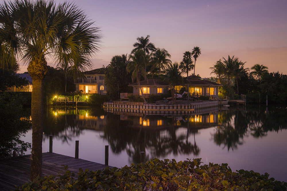
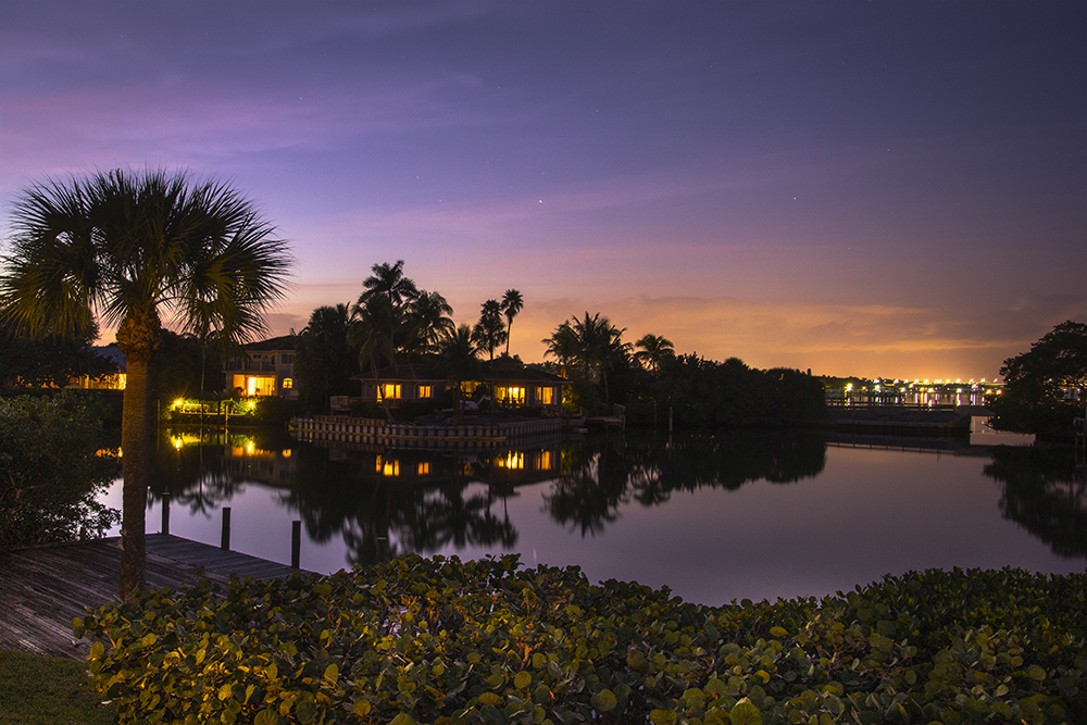
My friends over at the collective blog Focusing on Life are working on “night photography” this month so I thought I’d give it a try. I haven’t always been happy with my night photography so I definitely need more practice here. So I pulled out the trusty tripod the other night and tried to capture the lagoon that we can see from where we’re staying.

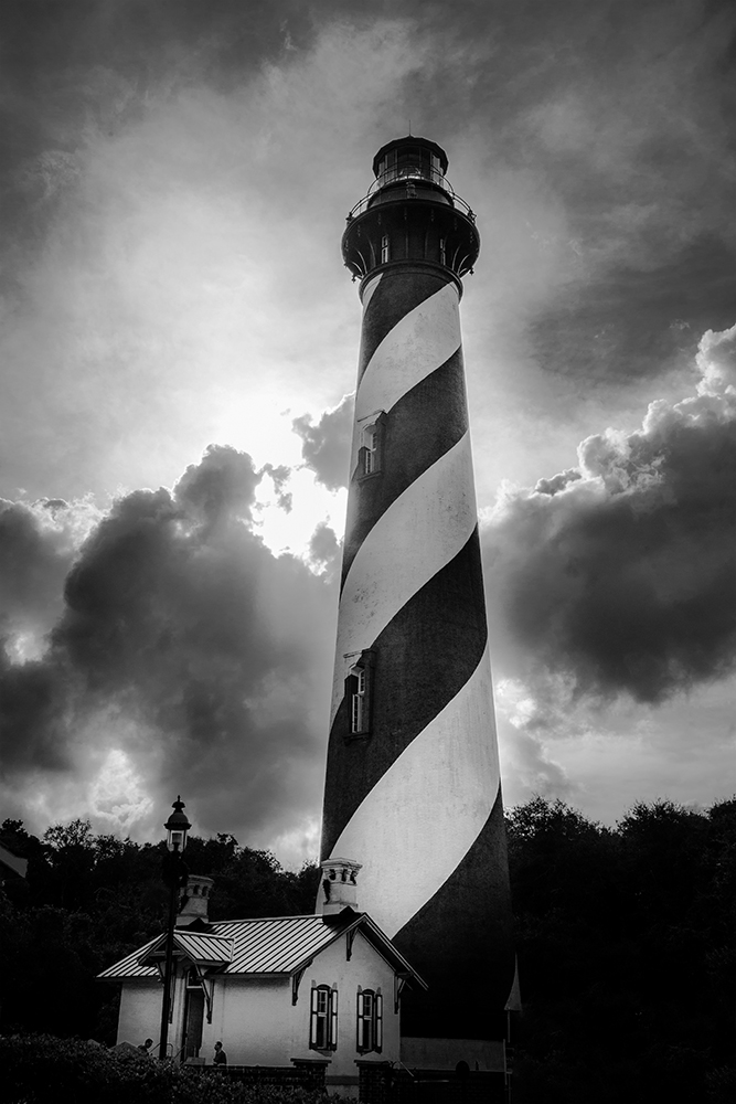
On the way down to Florida, we made a stop in St. Augustine — the oldest city in North America — and a favourite place of mine. I love the old buildings and the character of the aging Florida cottages. And of course, I had to visit the lighthouse. I was lucky to arrive just as the sun was breaking through the clouds behind it, which made for a dramatic shot.

lighthouse st a

Last year, the word I chose to guide myself was “light.” And without even thinking about it much, I  saw my photographs change organically to be much more aware of and sensitive to light. I learned about how to deal with different kinds of light and what kind of light I gravitated to. For photographers, who literally “write with light,” this is a study that never ends.

So I’m not yet finished with “light.”

I told one of my dear sister photographers some time last year that I was taking my photography more “seriously.” She never fails to remind me that it seems to be paying off. So, no need to fix an approach that’s not fundamentally broken. But, being serious doesn’t mean you can’t have a ton of fun!


Colours of the Bahamas…Part 2

Iconic tree in the golden hour

Granddaughter on the veranda

I posted Part 1 of Colours of the Bahamas here, images I made on a recent trip to the Bahamas for a family reunion, which featured blue and green tones.

Of course there are also other beautiful warm colours like gold, pink, orange and red also found throughout tropical  islands. I really appreciate those beautiful tones too. They are so vibrant and uplifting.

For this post, I thought it might be fun to share a few random facts about Harbour Island.

1. The island is known as “Briland” to its inhabitants, and it’s only 3.5 miles long by 1.5 mile wide. (Say Harbour Island fast and you’ll get it.) You can get from the bay side to the beach side in a few minutes.

2. Junkanoo is a colourful street parade that is held on New Year’s Day. The festival may date back to the 16th and 17th centuries. The slaves were given a special holiday to leave the plantations to be with their families and celebrate the holidays with African dance, music, and costumes. After emancipation, the tradition continued.

3.The staple food for islanders is a mollusc called a conch fish (pronounced ‘conk’). These rubbery, squid-like offerings are combined into a hot tomato and onion salad or battered and deep-fried as fritters or eaten in a wonderful chowder.

4. In local dialect, “sip sip” means to gossip and “purge” means to vent rage. If you are “showing sef”, you are showing off. And if you “spilligate” you’re going out on the town.

5. A local Bahamian delicacy is coconut bread, a moist bread with a delicate crumb and flavour, which is magnificent toasted and served for breakfast. Try it if you have the chance!

Sharing with Random Five Friday.

Colours of the Bahamas…Part 1

Our grandson and granddaughter had never seen the ocean before or been to the tropics. It was delightful to see them enjoying this warm and beautiful environment.

Harbour Island is one of the Bahamian archipelago of islands.

On our recent trip to the Bahamas for a family reunion, I was presented with a bit of a photography dilemma. There was so much beauty around me that I wanted to capture — not to mention wonderful images of family members enjoying themselves — it was tempting to never let my camera leave my eye!

But knowing that other family members would be taking shots and portraits to remind us of events and activities, I gave myself permission not to be everywhere at all times with my camera — and chose simply to focus my camera in directions that delighted me. It turned out to be a good decision; I got the images I most wanted and was able to be a participant as well as an observer. So I took no pictures of the scavenger hunt that was organized for us — I simply got into racing around the island with the rest on golf carts.

While it is true that used well, a camera can be a tool for slowing down, being present to your experience and seeing in a new way, if used without discernment, it can also separate you. I tried to keep this in mind..

As anyone knows who has spent time with a camera, the light changes constantly — and some light is more pleasurable to shoot in and makes for softer, more appealing images. I no longer try to fight with it and choose my shooting times more carefully. I also bracket my landscapes more often these days to allow for exposure fusion and making HDR images.

Two things I strive for in my photography are simplicity and harmonious colour palettes. The combination of blue and green is my all-time favorite colour combination — as well as the tones of turquoise and teal that result from a mixture — so I was in heaven in the Bahamas.

Here’s a rhyme that sailors share to read the colour of the water.

“Blue, blue, go on through.” The blues are safe water.

“Green, green, nice and clean.” Greens mean it’s starting to shoal, but still safe for all but large ships.

 “Brown, brown, run aground.” The browns are trouble-don’t go there.

“White, white, it just might…” White water, as in gin clear, is most confusing of all. It marks a sand bottom that might be inches or fathoms deep.

I’m fortunate to have been to the Bahamas a couple of time before, as well as all over the Caribbean — and the colours  I love are of course everywhere in the region. That’s why I’m an island gal at heart…

For now, I’ll leave you with an impressionistic portrait of an unforgettable trip — in blue and green.

Like a homecoming…

The experience of beauty is like a homecoming. When we feel and see and touch the beautiful, we feel that we are at one with ourselves, because in some subtle and secret way beauty meets the needs of the soul.

John O’Donohue

bouquet

Textured with Kim Klassen’s “Daisy”.

In August I will be joining many bloggers in taking a break from regular blogging — although I’m not all that regular at the best of times.  But I feel the need for a digital sabbatical so I can focus on some photo projects I’ve been hoping to do for a while.

I may pop in here as the spirit moves me to share an image or two from one of these projects…or something completely different.

In the meantime, I have a little poll for you…

I’d love it if you’d take a second or two to answer. If you prefer other types of blog posts entirely, feel free to mention this in the comments. Thanks so much for your views!

________________________________________________________________________________________________________________

Linking with Kim Klassen’s Texture Tuesday. Why not drop by and have a look?

texturetuesdaysbutton

Weekly photo challenge: Colour

bougainvilleapalette4

My grandmother had definite ideas about colour. She used to say that pink and orange “screamed” at each other. I think it stemmed from the fact that she was blessed with thick auburn tresses and had been told she could never wear pink because it would clash with her hair! And did you ever hear the one: “Blue and green should never be seen”? That happens to be one of my very favorite colour combinations.

Thank goodness ideas about colour change over time.

I have written about my colour preferences in photography before. It’s fascinating to go through your archives and pay attention to what colours and combinations you are repeatedly drawn to and how you handle colour in your photography. I highly recommend it.

I have noted that I generally steer away from riotous mixtures of primary colour. Well, not always! The image above is a multi-coloured bougainvillea hedge that we pass all the time.  Yellow, red, pink, orange and purple flowers all coexist perfectly side by side. No screaming, no clashing!  (I do think the harmonious effect is helped by the shallow depth of field though…)

I added the colour storyboard at the bottom as part of the challenge for Week #11 of an online course I’m taking with Kim Klassen. I doubt this palette would have appealed to my grandmother…How about you?

Don’t forget to check the Daily Post for more colourful entries.