Processing Tip #4: Toning with the Colour Lookup Table


Irises

Original image

Variations

Sometimes you want to render the colour in your colour photographs exactly the way you saw it. And sometimes you don’t. In truth, often you don’t, if your goal is to create a mood or convey a feeling rather than simply document a scene.

And how many ways are there to change and tweak colour using image editing tools such as Adobe Camera Raw, Photoshop or Lightroom? So many it makes my head spin. Plug-ins, presets, actions, not to mention using curves, LAB colour, hue/saturation adjustments and of course combinations of all of these.

But one way that I have become aware of only recently is Colour Lookup. (That’s what I love about Photoshop — I’ve been using it for 6 years and there are still features I’m discovering!)

This technique is fast, easy and can yield some nice results. It can be used for very subtle effects, which I prefer to over-the-top, more extreme changes.

I decided to take my recent iris image and play with it a bit to create a few other options to my original. I think I may even like some of these better! I’m particularly drawn to the slightly warmer tones.

Below is a link to an easy-to-follow tutorial:

How to use colour lookup in PS CS6 and CC

And now for an example of how you can use the technique to change the feel of a scene.

Well, here’s to yet another tool in the ol’ image processing toolkit!


Processing Tip #3: Be gone!

Most of the time I try to compose my images so as to eliminate distracting or unsightly elements. But every so often, you end up with a garbage can where you don’t want it, you know what I mean?

That’s when I love using content-aware fill. You simply draw a selection around the offending element, go to the edit menu in Photoshop CC, select “fill” and pick “content aware” in the “use” box. The next thing you know Photoshop has removed the item you don’t want. Somehow it can figure out what should be there instead! That’s the amazing “content-aware” technology.

Before

charles posing before

Screenshot 2015-05-28 13.13.21

Screenshot 2015-05-28 13.13.42

After

no garbage

There’s so much more to this wonderful content-aware technology. If you’re interested, have a look at this great video with Julianne Kost, one of the best Photoshop instructors ever. And have fun getting rid of those garbage cans.

How to use content-aware with Julianne Kost

Something universal…

I often find myself deeply moved by the writings of photographers I admire, as well as their photography. I copied this quote from Kim Manley Ort, photographer, teacher, writer and fellow explorer, when I read it, and I wanted to share it with others, who I think will also appreciate it.

Irises

My mission in life is to fully experience and embrace life with my whole self – mind, body, and heart – to really see. I’ve found that photography helps me to do this through fully connecting with and being transformed by ordinary moments. Something universal resonates deep inside – and I feel tender, hopeful, transparent, connected, and present. It is magical and opens me up to how everything (including me) belongs. I hope that when others look at my photography, they see that every moment is worthy in and of itself.

Kim Manley Ort

Great photobook offer…

for poster two

Artisan State has a great offer on now for photobooks, which is good until the end of May.

I’ve created many photobooks with them in the past and have always loved the result.

I couldn’t resist this sale — an 8″ by 8″ book for $10 instead of $35, so I quickly put one together last night with some of my favourite images of this past winter. I call it Cruising in the Abacos on Windsong II, 2015.

I invite you to have a look at  my photobook with Artisan State. You may just want to whip one up too! I’d love to hear what you think if you do…

Processing Tip #2: The Cinematic Look

Do you sometimes feel like your life is a movie? Well, whether you do or don’t, it can be fun to make it look like one.

I ran across this article on Fstoppers.com and thought I would  give some of the techniques a try. I find the 16:9 crop really enhances some images and it’s just a couple more steps to create the “letterbox effect.”

See you in the movies!

Tips for making your images look like they’re straight out of films 

 Follow this for the “letterbox effect.”

BEFORE

before cinematic

Taken at the International Cool Climate Chardonnay Celebration held every summer in the Niagara Region of Ontario

AFTER

cinematic demo

Processing Tip #1: Blue-skying

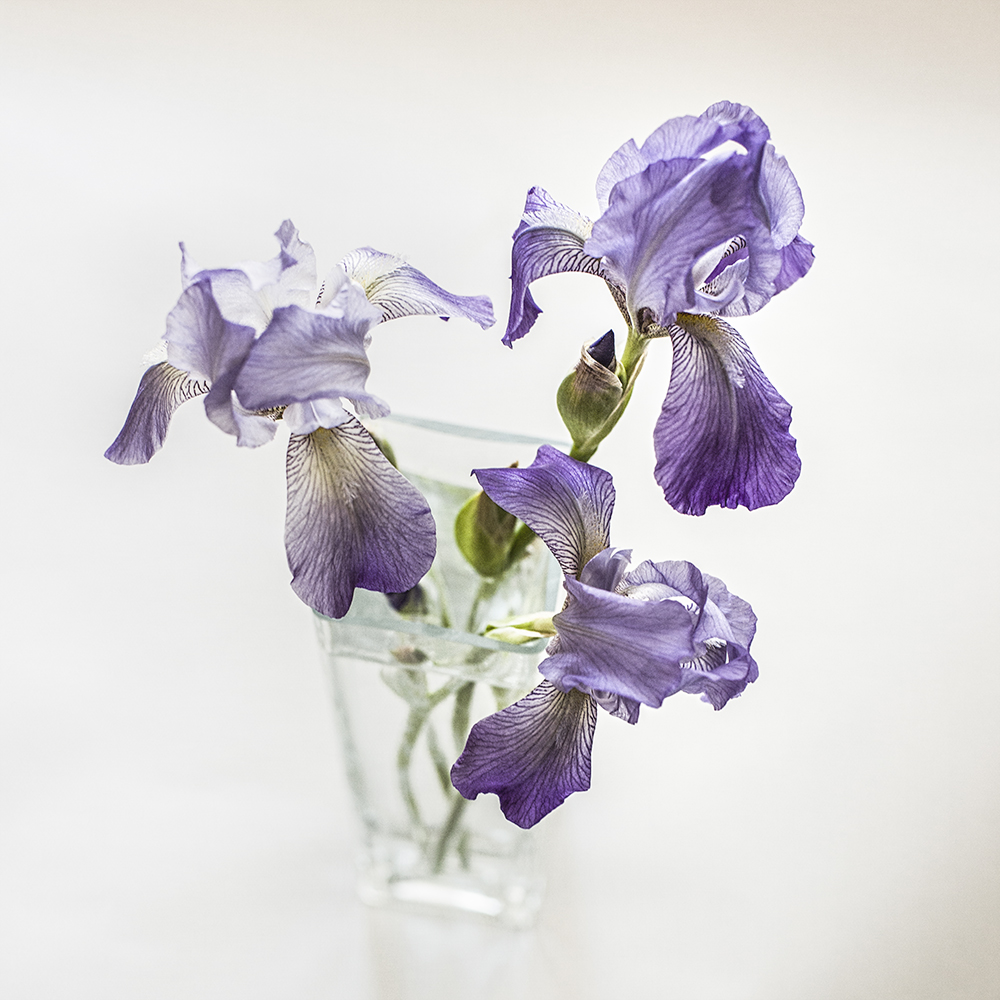
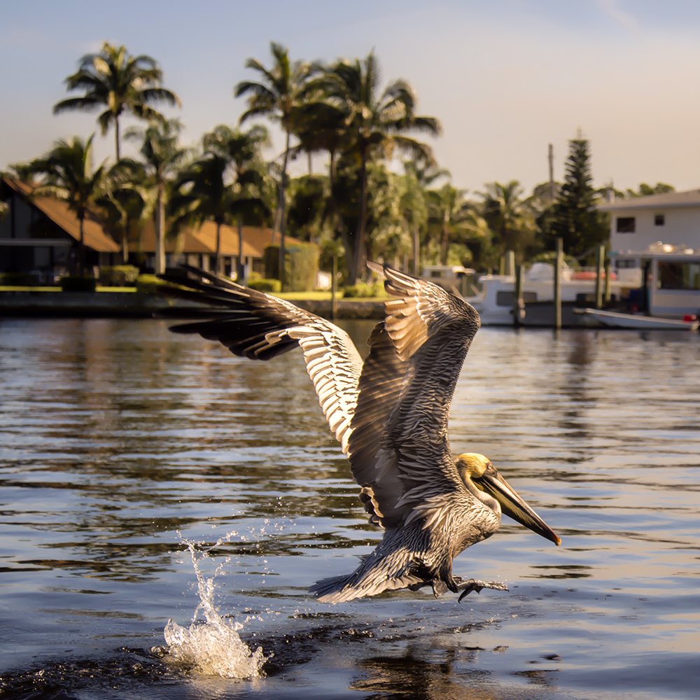
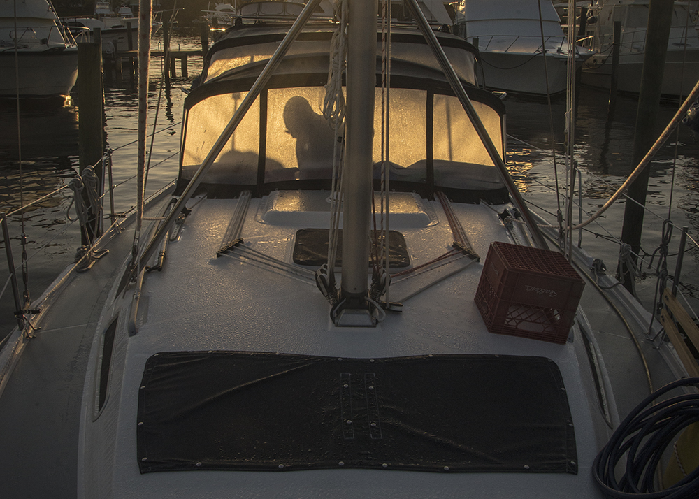
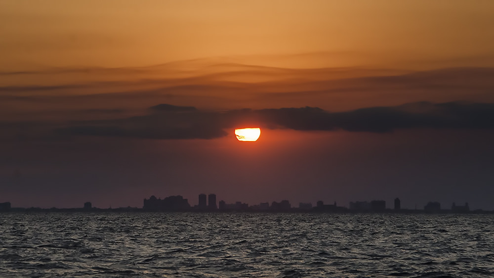
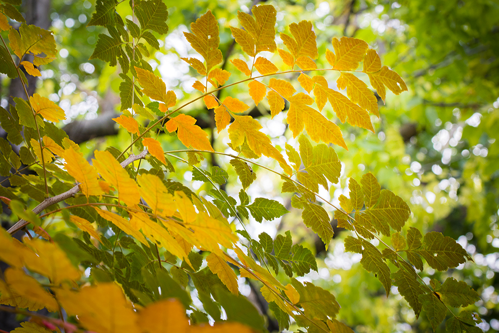
I’m back in Canada now after four months of living and cruising on our sailboat, Windsong II, in Florida and the Bahamas. As you can imagine, the photo opps were astounding and I did my best to fill up my camera cards with images. Tons of images.

Images that make my heart flutter when I look at them and they bring me back to the feelings of awe and wonder I experienced daily.

Images I now have to go through and delete or process.

I shoot RAW so I don’t have a choice about processing — I have to do it because the image straight out of the camera (SOOC) is not already processed by the camera in the way that jpegs are. A raw image is  like a digital negative and has to be developed in the same way that film negatives have to be developed and tweaked in the dark room.

Processing demands myriad decisions on the part of the photographer about how to present your image to best express what you saw and felt when you clicked the shutter and what you want to share.

Sometimes what comes out of the camera just doesn’t reflect what you saw — because our camera does not have the dynamic range of our eyes or because we didn’t expose properly for the conditions or for some other reason. So we fix things up during the editing process…

I’m always learning about processing — it’s a never-ending journey that I derive so much pleasure from. I’m constantly searching for better ways to achieve and express my vision in my images.

I gather information and ideas from books, other blogs, podcasts, video tutorials, e-books and online classes. I’m forever trying out new techniques. Some I keep and return to over and over — some do nothing for me. To me, editing is not a necessary evil — it’s part of the joy of the creative process.

I’m thinking that many of you are like me and it might be fun to share each other’s experiments.

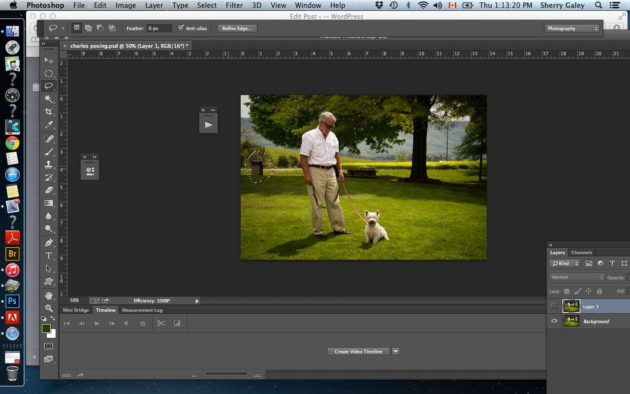
So I decided to launch a new series of processing tips, in which I share some simple processing techniques that I pick up and test out. I mainly use Adobe Photoshop CC, Adobe Camera Raw and Lightroom.

I’ll share the link to the source of the information, which will contain the how-to’s so you can try it out too — and I’ll share my results.

So, on to Tip #1…

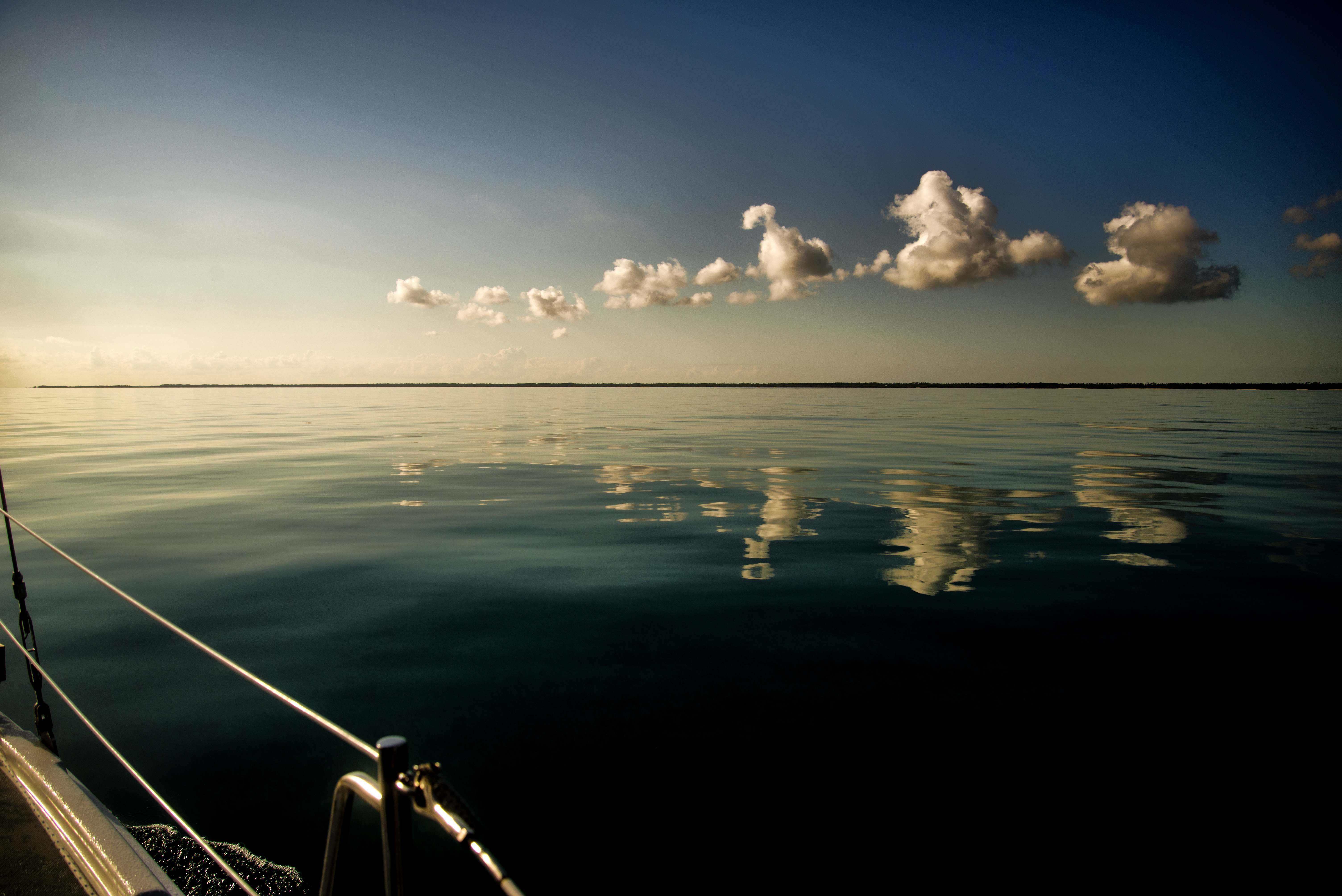
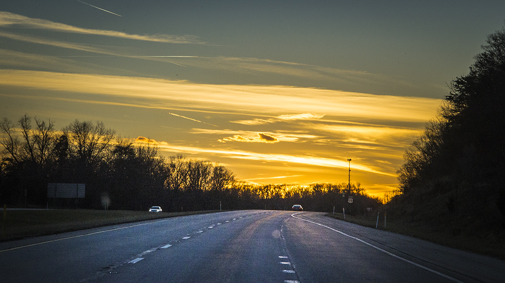
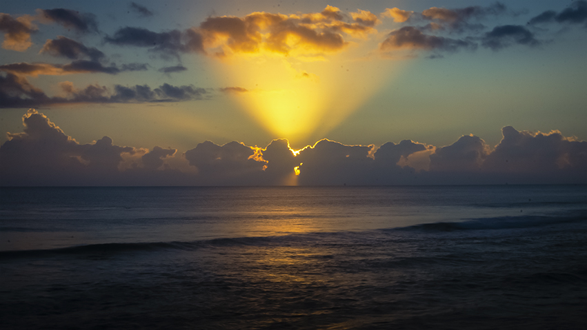
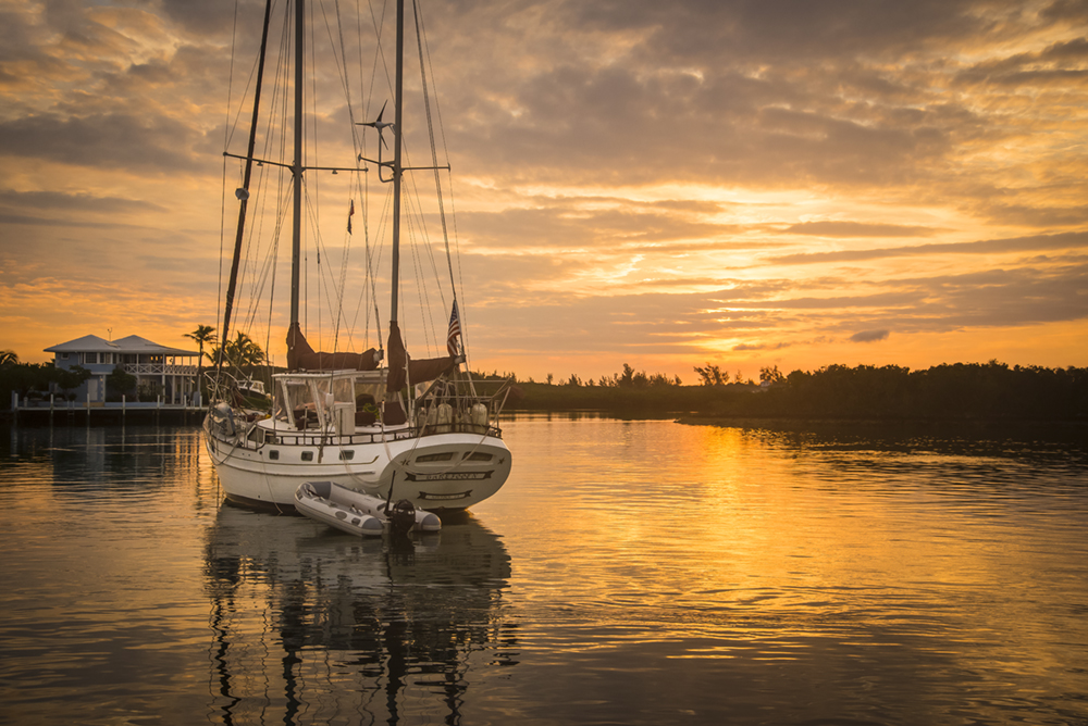
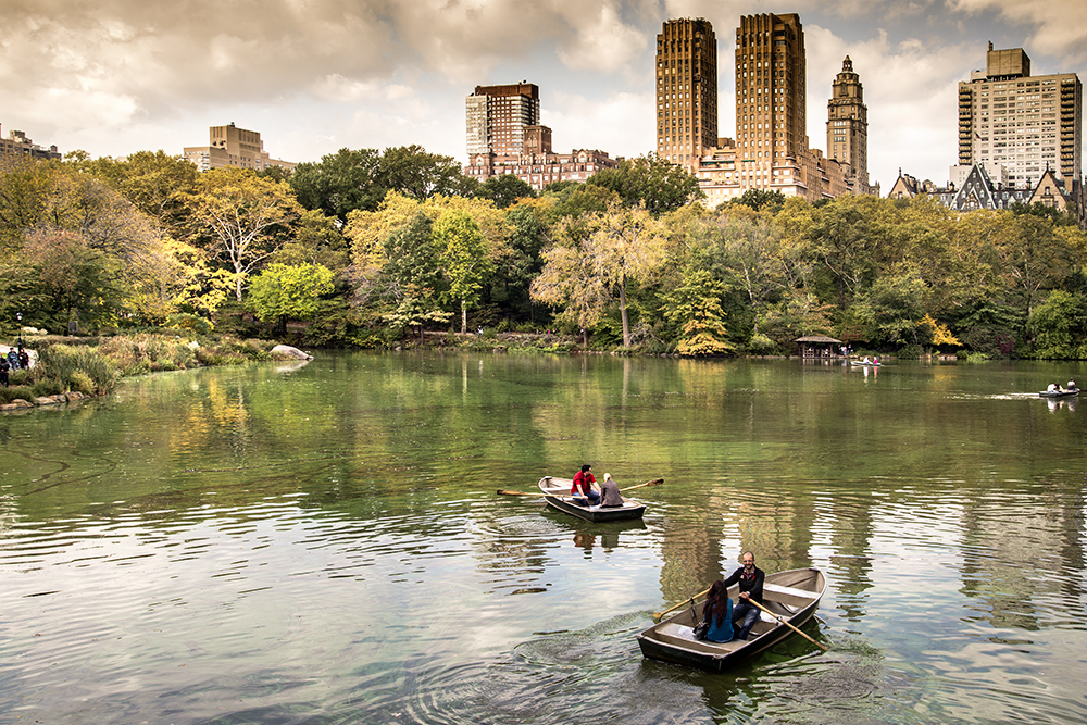
I saw this tip on Lightstalking. It’s great for pepping up those washed out or bland skies that we all struggle with from time to time.

Now, of course there are many other ways to achieve the same goal — both in camera, using filters and through processing. But this is a quick and easy way to deepen the blues of your skies in a natural looking way. By combining targeted changes to the exposure and saturation, the result is very pleasing.

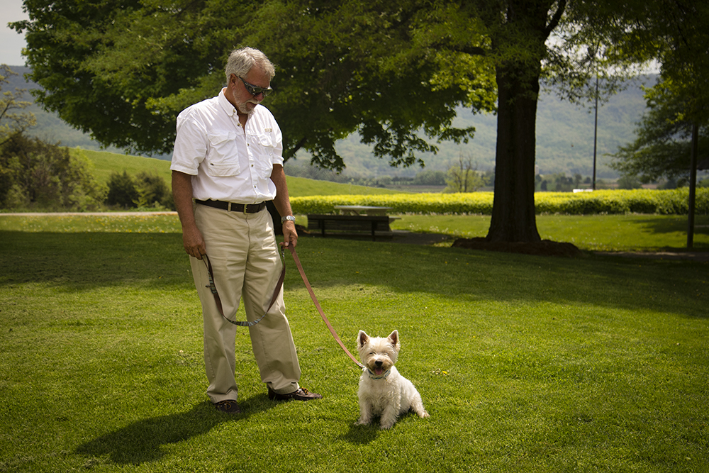
Here is my image — before and after. See what you think…

I’d love it if you’d share your go-to methods for doing the same thing, in the comments or on your blog.

BEFORE


overdraught - sqbf

Before


AFTER


overdraught - sqafterfin

After


A look back at 2014, Part 1

The time between Christmas and New Year’s is a perfect one to look back on the year that is coming to an end, and to marvel at its wonders and joys, as well as to reflect on its challenges and bittersweet moments. They’re all part of the great mystery of life…

I thought I’d go back through my images to select some that are meaningful to me. These are not necessarily my best, but they do resonate with me and represent a year full of wonderfully rich memories.

I’ve preserved these images in photobooks and archives for the future. I’m grateful to have them and be able to look at them any time I want to bring back so many days and moments in all their glorious colour and intensity.

But there are many more moments and memories from this past year that I don’t have pictures of. I am just as thankful for the ones that remain alive only in my mind’s eye.

sparkof grace light FB

Sunrise, Hutchinson Island, Florida


sparkles-small

New Year’s Parade, Harbor Island, Bahamas


pelican 7small

Pelican, Manatee Pocket, Florida


up eary leaving mariner cay

Early morning, Mariner Cay, Marina, Stuart, Florida

13875054984_df67e8ba38_b

Sunset, crossing the Gulf Stream on our sailboat, heading to the Bahamas from Florida


bob fishing calm day on way to great sale cay-500

Fishing on the Little Bahamas Banks, Bahamas


cute charles

Charles, the intrepid sailing dog


Typical sunset in the Bahamas

wines from all over blog

Celebration of Chardonnay in Niagara region, Ontario


girl and flag

Celebrating Canada Day in Almonte

park hands

A good-bye weekend with the grandkids

tender moment

A tender moment…


central park leaves

Fall is my favourite season

central park boaters copy

New York is one of my favourite cities…


hanging on for blog

Can’t get enough autumn colour…


barn

Exquisite light on Christmas Day

almonte xmas 2014

The sun kisses my town…