Peonies…

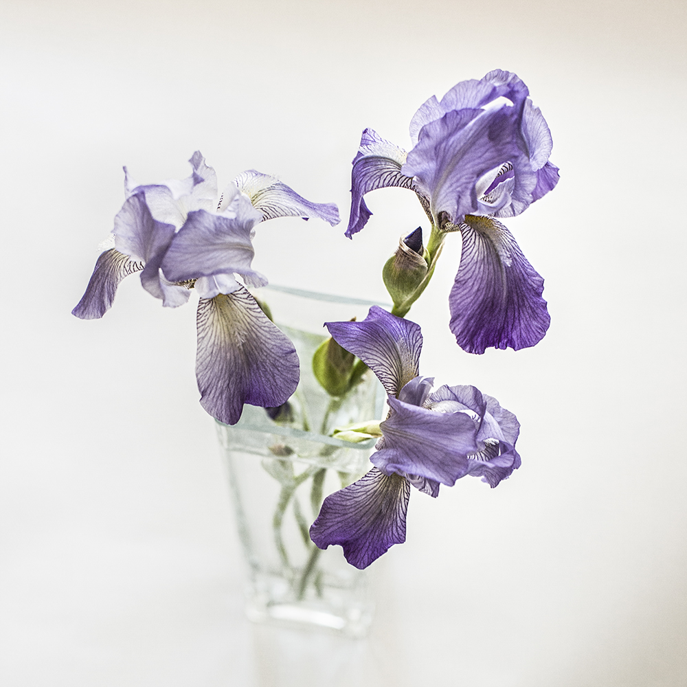
I planted peonies in my new garden last year. Peonies were one of my favourite flowers as a kid.  I remember them fondly from our garden in the West Island of Montreal. We had lilac bushes, crabapple trees and plum trees. We had irises too. Oh yes, and tulips and daffodils. Marigolds also, I think.

peony garden portrait

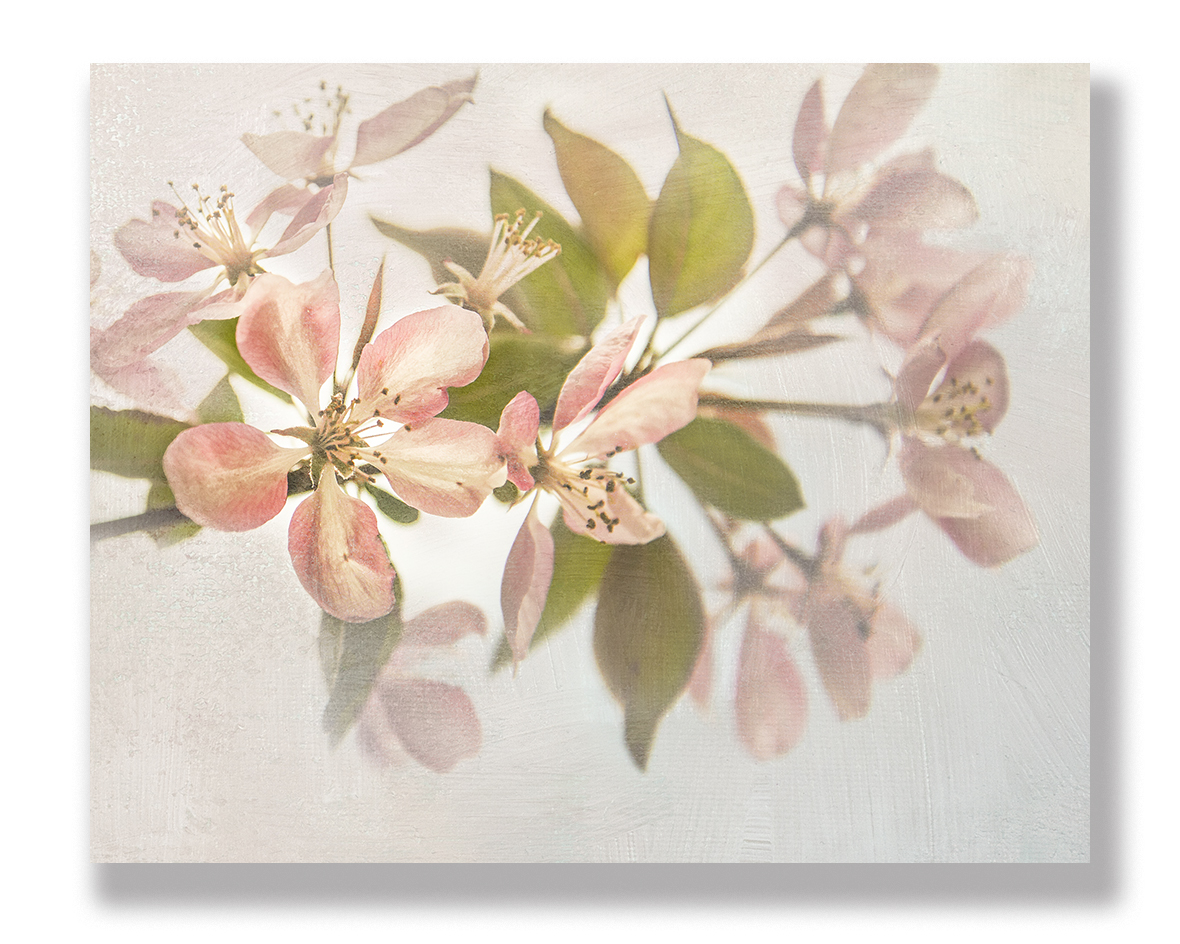
This was shot at F 2.2. I wanted a shallow depth of field in order to focus on the bloom. After doing basic conversion in Camera Raw, I added an adjustment layer of Colour Lookup and added Filmlook for, well, the look of film.

But it was the peonies that won my heart for having both a delicate frilled beauty and an unforgettable fragrance, which heralded early summer and its longer, languid days. And peonies had such a short life too — they were a sweet reminder that many good things in life are fleeting, so paying attention and having appreciation is in order.

When I first saw the peonies unfurl to the sun this year, I ran out with my camera to capture them in situ. I quickly bent to have a sniff. I could not believe the scent — it was even better than I remembered. Not sweet or sickly — just perfect. I inhaled deeply. Then I went to work shooting them in the garden.

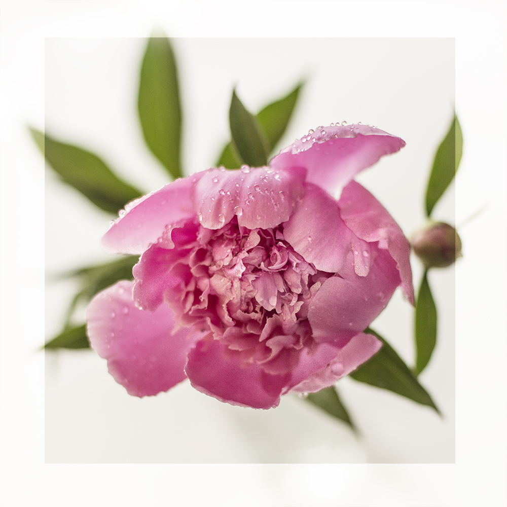
I like this one, which was shot from above, just because it’s a bit different. I used the adjustment brush to try to bring out the rain drops on the bloom.

After that, I brought one in and placed it in a clear vase. It was still wet from the rain. I took shots from many angles with different apertures, all against a white background, trying to pay attention to the composition. I was going for something pure and simple. Trying to convey the spirit of the peony.

Then I moved the vase into the kitchen so it was backed by my window to the back yard. I made some images in the golden morning light, again with different apertures, but mostly large because I didn’t really want the peonies to have to fight for attention with the back yard!

Once I was finished shooting, I began to process the raw images. I  use Adobe Camera Raw to start with and then for some of the images I played with my new favourite tool in Photoshop, Colour Lookup.


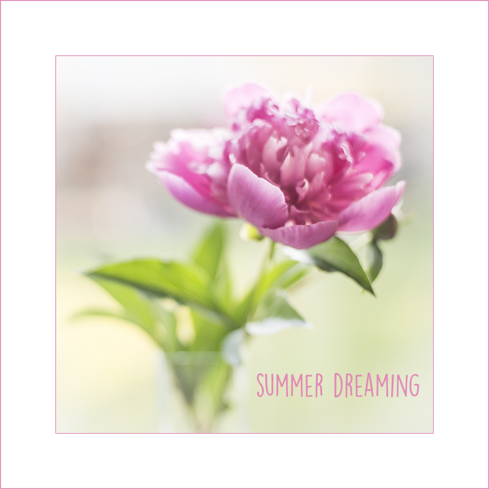
This was shot at F 3.2 so it’s crisper and more of the flower is in focus than at larger apertures. Here I wanted to emphasize the golden light in the background.

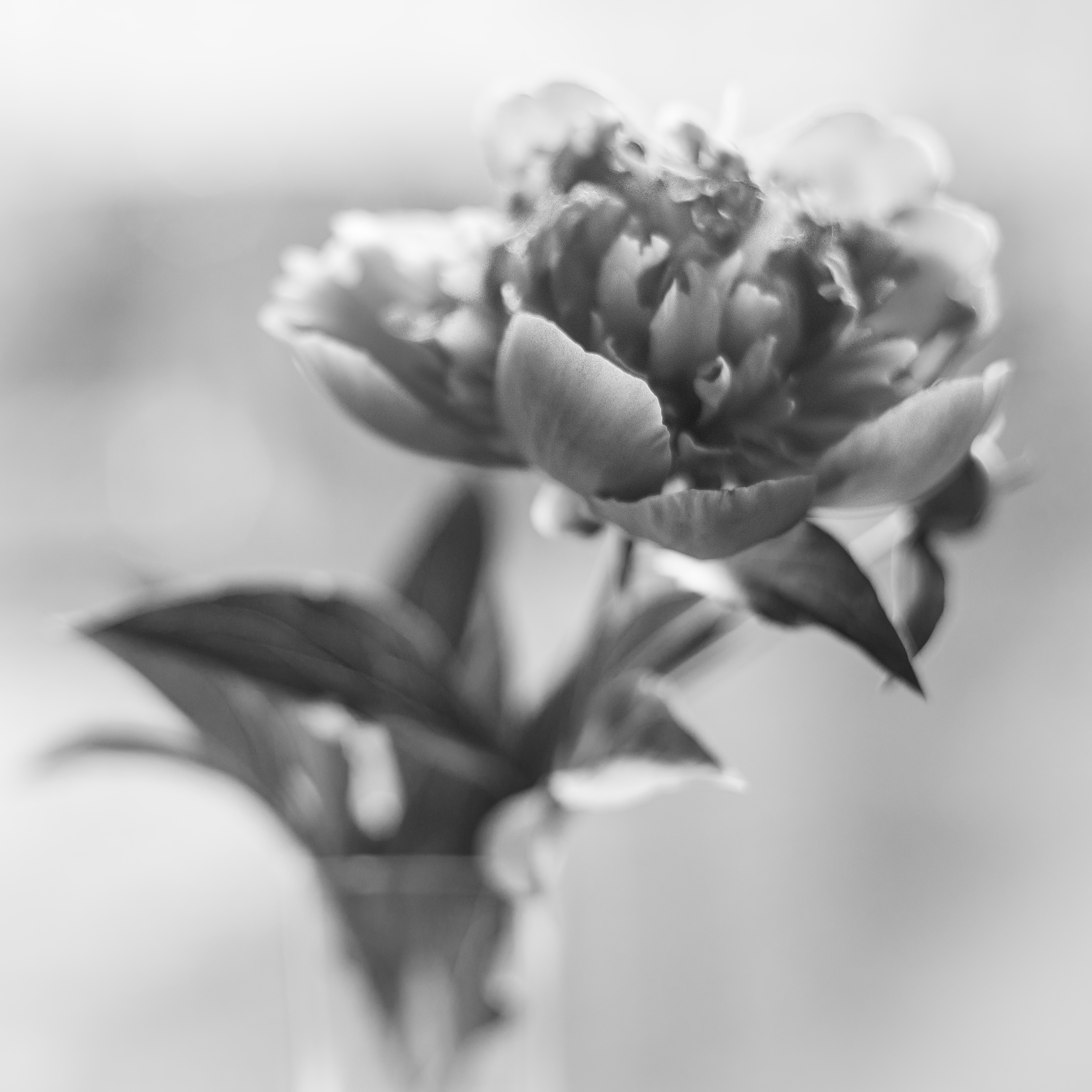
I don’t very often convert my flower images to black and white unless they are very contrasty. I thought I would see how a more dreamy image turned out. I like it — it’s moody — but in general, I think peonies are better in colour!

peony framed

This was shot at F 2 so it’s really quite painterly and dreamy. It evokes memories of summer as a kid, when we spent almost all our time outside — in the fields and playgrounds and backyards.  We’d come in for supper and be greeted with the scent of peonies in a vase on the table.


Processing Tip #4: Toning with the Colour Lookup Table


Irises

Original image

Variations

Sometimes you want to render the colour in your colour photographs exactly the way you saw it. And sometimes you don’t. In truth, often you don’t, if your goal is to create a mood or convey a feeling rather than simply document a scene.

And how many ways are there to change and tweak colour using image editing tools such as Adobe Camera Raw, Photoshop or Lightroom? So many it makes my head spin. Plug-ins, presets, actions, not to mention using curves, LAB colour, hue/saturation adjustments and of course combinations of all of these.

But one way that I have become aware of only recently is Colour Lookup. (That’s what I love about Photoshop — I’ve been using it for 6 years and there are still features I’m discovering!)

This technique is fast, easy and can yield some nice results. It can be used for very subtle effects, which I prefer to over-the-top, more extreme changes.

I decided to take my recent iris image and play with it a bit to create a few other options to my original. I think I may even like some of these better! I’m particularly drawn to the slightly warmer tones.

Below is a link to an easy-to-follow tutorial:

How to use colour lookup in PS CS6 and CC

And now for an example of how you can use the technique to change the feel of a scene.

Well, here’s to yet another tool in the ol’ image processing toolkit!


Processing Tip #3: Be gone!

Most of the time I try to compose my images so as to eliminate distracting or unsightly elements. But every so often, you end up with a garbage can where you don’t want it, you know what I mean?

That’s when I love using content-aware fill. You simply draw a selection around the offending element, go to the edit menu in Photoshop CC, select “fill” and pick “content aware” in the “use” box. The next thing you know Photoshop has removed the item you don’t want. Somehow it can figure out what should be there instead! That’s the amazing “content-aware” technology.

Before

charles posing before

Screenshot 2015-05-28 13.13.21

Screenshot 2015-05-28 13.13.42

After

no garbage

There’s so much more to this wonderful content-aware technology. If you’re interested, have a look at this great video with Julianne Kost, one of the best Photoshop instructors ever. And have fun getting rid of those garbage cans.

How to use content-aware with Julianne Kost

Processing Tip #2: The Cinematic Look

Do you sometimes feel like your life is a movie? Well, whether you do or don’t, it can be fun to make it look like one.

I ran across this article on Fstoppers.com and thought I would  give some of the techniques a try. I find the 16:9 crop really enhances some images and it’s just a couple more steps to create the “letterbox effect.”

See you in the movies!

Tips for making your images look like they’re straight out of films 

 Follow this for the “letterbox effect.”

BEFORE

before cinematic

Taken at the International Cool Climate Chardonnay Celebration held every summer in the Niagara Region of Ontario

AFTER

cinematic demo

Processing Tip #1: Blue-skying

I’m back in Canada now after four months of living and cruising on our sailboat, Windsong II, in Florida and the Bahamas. As you can imagine, the photo opps were astounding and I did my best to fill up my camera cards with images. Tons of images.

Images that make my heart flutter when I look at them and they bring me back to the feelings of awe and wonder I experienced daily.

Images I now have to go through and delete or process.

I shoot RAW so I don’t have a choice about processing — I have to do it because the image straight out of the camera (SOOC) is not already processed by the camera in the way that jpegs are. A raw image is  like a digital negative and has to be developed in the same way that film negatives have to be developed and tweaked in the dark room.

Processing demands myriad decisions on the part of the photographer about how to present your image to best express what you saw and felt when you clicked the shutter and what you want to share.

Sometimes what comes out of the camera just doesn’t reflect what you saw — because our camera does not have the dynamic range of our eyes or because we didn’t expose properly for the conditions or for some other reason. So we fix things up during the editing process…

I’m always learning about processing — it’s a never-ending journey that I derive so much pleasure from. I’m constantly searching for better ways to achieve and express my vision in my images.

I gather information and ideas from books, other blogs, podcasts, video tutorials, e-books and online classes. I’m forever trying out new techniques. Some I keep and return to over and over — some do nothing for me. To me, editing is not a necessary evil — it’s part of the joy of the creative process.

I’m thinking that many of you are like me and it might be fun to share each other’s experiments.

So I decided to launch a new series of processing tips, in which I share some simple processing techniques that I pick up and test out. I mainly use Adobe Photoshop CC, Adobe Camera Raw and Lightroom.

I’ll share the link to the source of the information, which will contain the how-to’s so you can try it out too — and I’ll share my results.

So, on to Tip #1…

I saw this tip on Lightstalking. It’s great for pepping up those washed out or bland skies that we all struggle with from time to time.

Now, of course there are many other ways to achieve the same goal — both in camera, using filters and through processing. But this is a quick and easy way to deepen the blues of your skies in a natural looking way. By combining targeted changes to the exposure and saturation, the result is very pleasing.

Here is my image — before and after. See what you think…

I’d love it if you’d share your go-to methods for doing the same thing, in the comments or on your blog.

BEFORE


overdraught - sqbf

Before


AFTER


overdraught - sqafterfin

After


August break, Day 10

drink2

Drink in the cool stillness and refresh your soul…

I have to say that I’m thrilled with some of the new features of Adobe Camera Raw in Photoshop CC.  Straightening lines and removing distortion has become so incredibly fast and easy. Problems in perspective and converging verticals used to plague me. I would stay away from photographing buildings and architecture because of that. But no more. 

Here’s a great little video about five features to love. Julieanne Kost, Adobe’s Principal Digital Imaging Evangelist, is one of my favorite teachers — direct, to-the-point and easy to follow. Whether you use PS or Lightroom, she knows all, and teaches all, so well.

You may already be familiar with Julieanne and her tutorials. But did you know that she is also a fabulous photographer? Because she travels so much for her work, she found herself taking lots of pictures out of airplane windows. This resulted in one of the most beautiful and astonishing collections of “window seat” images I’ve ever seen.   Why not take a trip with Julianne?


A time for refinement…

crab

The feeling of an evolution is a constant for every artist who is pursuing the search for refinement and enlargement of his/her own means of expression.

Andrea Bocelli

I was very much into using textures to process my images a year or two ago. I loved the painterly look that you could achieve and the soft dreamy quality of so many textured images.

I’m still drawn to these images and I admire and enjoy the texture work on the blogs and sharing sites of so many artists and photographers I’ve met online.

But I stepped away from it myself, and this is why…

At one point I realized that I didn’t want to use heavy processing with textures as a crutch when I didn’t know what to do with a less than stellar image. So I decided what I needed to do was spend more intensive time learning and practising and honing the craft of photography — which is really what I’m in love with. I wanted to take full advantage of my equipment and make better base images — by honing key skills — exposure, composition and framing, and focus, for example. I wanted to do a better job of getting my images right in camera.

I also wanted to delve deeper into the hard work of discovering and developing my own unique approach and vision. This has challenged me to become more contemplative and intentional in my image-making, as well as more experimental and risk-taking. I feel I’ve seen an improvement in my images and while many of my experiments have not seen the light of day, they have also yielded some happy results and taught me so much. And not only have I gained ground by working on simplicity, abstracts, double exposures, long exposures, ICM, etc etc etc, I’ve also truly enjoyed every moment. The more I can master the craft, the more my images will become a means for expressing myself.

Over the next while I intend to continue to strive for the best image quality I can get from my camera, I also want to return to spending time refining my processing techniques. For example, I want to learn luminosity masking and make better use of Adobe Camera Raw for raw conversion. (ACR is basically the same as Lightroom, without all the photo organization abilities.) I just learned a few new ACR and Photoshop techniques from a video with Ben Willmore on Creative Live that have me quite excited.

And so just for fun I hauled out my textures the other day and had a play with a few recent crabapple images. I’ve learned that when I start off with a better quality image, I am generally happier with the results of adding textures. My taste is at the “less is more” stage so I went fairly light on the processing of this image to let the beauty and delicacy of the crabapple blossoms shine through.

What are you refining these days?


Orbs — the easy way…

A little while ago, I promised a tutorial on how to make orbs in Photoshop.

If you arrived at my blog from Toad Hollow’s 88 Amazing Photography Links… on Lightstalking, WELCOME! I’m very glad to have you. I hope you enjoy this tutorial. Feel free to stay awhile and check out some of my other posts on photography. If you like what you see, you may want to subscribe to the blog so you don’t miss any posts.

And without further ado, the tutorial…

Start by selecting an image and cropping it to a square. Say, like this.

Screen shot 1

Now, make sure your image is in 8 bits per channel, not 16, or the rest won’t work. You can check this by going into Image > Mode.

Screen shot 2013-06-20 at 10.01.51 AM

The next step is to go into Filter > Distort > Polar Coordinates.

Screen shot 2013-06-20 at 10.02.15 AM

Click on Polar to Rectangular and OK.

Screen shot 2013-06-20 at 10.02.29 AM

The result.

Screen shot 2013-06-20 at 10.02.35 AM

Then you’ll want to flip your image vertically by going Image > Image Rotation > Flip Canvas Vertical.

Screen shot 2013-06-20 at 10.02.42 AM

The result.

Screen shot 2013-06-20 at 10.02.46 AM

Then go back to Filter > Distort > Polar Coordinates…

Screen shot 2013-06-20 at 10.02.53 AM

Only, this time, click on Rectangular to Polar and OK.

Screen shot 2013-06-20 at 10.02.59 AM

And there you have it! Easy peasy, right?

Screen shot 2013-06-20 at 10.03.04 AM

Now you can apply whatever other effects or textures you want to tweak the image or you can frame the image…

Play to your heart’s content.

Have fun with this technique, and if you feel like it, share your images with me in the comments, and I’ll post some on my blog.

goldenorb

Bokeh ball

Nowhere else in the observable universe…

Image location: near Kitchener Ontario; Technique: Intentional Camera Movement; Processing: Flypaper Textures

Go outside, now, and look at any randomly selected piece of your world. It could be a scruffy corner of your garden, or even a clump of grass forcing its way through a concrete pavement. It is unique.

Encoded deep in the biology of every cell in every blade of grass, in every insect’s wing, in every bacterium cell, is the history of the third planet from the Sun in a Solar System making its way lethargically around a galaxy called the Milky Way.

Its shape, form, function, color, smell, taste, molecular structure, arrangement of atoms, sequence of bases, and possibilities for a future are all absolutely unique.

There is nowhere else in the observable Universe where you will see precisely that little clump of emergent, living complexity.

It is wonderful.

Brian Cox